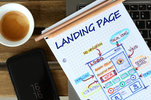
Your landing page is the first point of contact in your affiliate marketing campaign, and it has just a few seconds to make an impression. That brief moment can turn a visitor into a lead or send them on their way. It’s not about flashy designs; it’s about crafting a professional landing page that speaks to your audience and guides them toward taking action.
Whether you’re promoting a high-ticket item or capturing leads, the elements of your page can significantly influence conversion rates. From persuasive copy to seamless mobile optimization and trust-building features, each detail matters.
So, how can you build a landing page that truly converts? Keep reading, we’re about to share five actionable tips that will elevate your affiliate campaigns and boost your results.
5 Tips to Create a Professional Landing Page for Affiliate Campaigns
1. Craft a Clear, Attention-Grabbing Headline
Think of your headline as your one shot to stop the scroll. When someone lands on your page, they are not reading. They are scanning. In that split second, your headline needs to do two things fast. Tell them what they are getting and make them care enough to keep going.
Forget clever puns or vague hype. What matters is clarity. Speak directly to the problem your audience is trying to solve. If your offer helps save money, simplify a task, or avoid a hassle, say so. A headline like “Slash Ad Spend Without Losing Leads” does not waste time. It gets straight to the value.
Good headlines also carry a pulse. Words like “now,” “exclusive,” or “unlock” can prompt action when used with purpose. You are not writing to impress. You are writing to connect.
There is also a strategic side to headlines. It’s important to consider the intent behind your campaign. If your affiliate campaign focuses on short-term results, your messaging needs to match that urgency. Understanding the difference between Brand Marketing and Performance Marketing can guide everything from your headline to your CTA. Brand marketing builds a name over time, while performance marketing focuses on quick, measurable actions. Your headline should reflect the goal, whether it is sparking curiosity or driving immediate clicks.
An effective headline does more than start a page. It starts a conversion journey.
2. Use Persuasive, Benefit-Driven Copy
Visitors do not come to your landing page to admire your grammar. They come with a question in mind. Will this help me? That is where your copy steps in. Not to describe, but to convince. The most convincing messages are the ones that clearly show how life improves after taking action.
Instead of flooding the page with product features, turn those features into real outcomes. If a tool automates tasks, explain how that gives someone their time back. If it saves money, explain what that extra cash could help them achieve. Great affiliate landing pages focus on the reward, not just the offer.
Strong copy also anticipates frustration. If your audience is tired of juggling too many tools or making slow progress, position your offer as the answer they have been looking for. Copy that reflects your visitor’s thoughts creates a connection. And connection builds trust.
A gentle sense of urgency can also help move someone forward. Mentioning limited access or upcoming deadlines can nudge hesitant visitors without pressure. Let the value lead, and use urgency as support. You are not just writing to sell. You are writing to show someone they have finally found what they were searching for.
3. Keep the Design Clean and User-Friendly
Ever landed on a page that looked more like a puzzle than a website? Buttons everywhere, flashing graphics, too many fonts fighting for your attention. That is exactly what you want to avoid. Your landing page should feel effortless to explore. When the design is clean, users instinctively know where to look and what to do next.
The most effective affiliate landing pages are simple by design. They guide the eye, not overwhelm it. Use generous white space to give your content room to breathe. Headlines, visuals, and the call to action should each have space to stand out. This makes your message easier to absorb and keeps the page from feeling crowded.
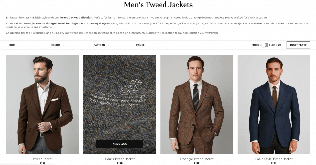
You can take inspiration from e-commerce landing pages. They’re simple, clean, user-friendly, and optimized for conversions. For example, take a look at the men’s tweed jackets collection page of StudioSuits. It has a very simple design, headlines, clear copy, and a super user-friendly CTA that cuts the noise for their customers.
Design consistency is another quiet hero. Stick to one or two easy-to-read fonts and maintain a unified color palette. Choose colors that reflect your brand and resonate with your audience. A dark gray font on a white background keeps things crisp and readable. Avoid loud background patterns or bright clashes that compete with your message.
Navigation should also feel invisible. Remove clutter like unnecessary links or auto-playing pop-ups that distract from the main goal. When users feel comfortable and clear on what to do, they are far more likely to act.
Think of your landing page like a conversation. The smoother it flows, the easier it is for someone to say yes.
4. Include Trust Signals (Reviews, Testimonials, and Social Proof)
Landing pages that lack proof often feel incomplete. Even if the offer seems solid, most visitors need to see that others have already had a positive experience. This kind of reassurance is what moves someone from interest to action.
Start by adding testimonials that feel real. A few authentic lines from people who have used the product or service can make a big difference. These stories help visitors relate and imagine similar outcomes for themselves. When someone reads that another person faced the same problem and found a solution, it builds confidence in your offer.
If you have any certifications or endorsements, feature them clearly. Whether it is an industry seal or a nod from a respected platform, these markers of credibility instantly boost trust. They show that your offer is not just another generic recommendation, but something that meets real standards.
Social proof is equally powerful. Mentioning how many people have already joined or purchased adds a sense of momentum. People feel more comfortable taking action when they know others have already done it successfully. Live counters, review ratings, or user badges can enhance that sense of trust even more.
At the end of the day, no one wants to make a decision that feels risky. Trust signals eliminate that risk by showing that your affiliate offer is tested, valued, and backed by others. That validation makes all the difference on a landing page built to convert.
5. Include a Strong and Clear Call to Action (CTA)

Once your landing page has done the work of building interest and trust, the next step is giving visitors a clear path forward. That is where your call to action comes in. It is not just a button. It is the final push that turns attention into conversions.
A strong CTA removes hesitation. It tells the visitor exactly what to do and what they will gain. Whether the goal is to generate leads or drive affiliate purchases, your message needs to be direct and confident. Avoid vague labels like “Submit” or “Click Here.” Instead, use phrases that focus on the benefit. Words like “Start My Free Trial” or “Unlock Access Now” make the next step feel rewarding.
The way your CTA looks can also influence how often it gets clicked. Use a color that contrasts with the rest of your visual layout without clashing. The button should be easy to find and impossible to ignore. Large, readable text with ample spacing helps keep it noticeable on both desktop and mobile screens.
CTA placement matters too. One should appear above the fold so visitors see it right away. Another can be placed toward the bottom, after they have read more about the offer. This gives users multiple chances to act, no matter where they are in the decision process. In a well-designed affiliate landing page, the CTA acts like a signpost. Clear, confident, and well-placed, it points the visitor to the exact result they came looking for.
Conclusion
At its core, a high-converting affiliate landing page does more than present an offer. It creates a clear, guided experience that moves visitors from curiosity to action. From the headline that pulls them in to the CTA that seals the deal, every element has a role to play.
You are not just building a page. You are building trust, directing attention, and encouraging a specific outcome. Strong headline copy sets the tone. Persuasive, benefit-driven language gives your message weight. Clean design makes your content easy to follow, while trust signals remove hesitation. And finally, a well-placed, action-focused CTA turns that interest into measurable results.
Each tip on its own makes an impact, but when combined with intention and tested for performance, they create a landing page that earns its clicks. Whether your goal is to grow leads or boost sales, these strategies help you build a professional affiliate page with purpose. In affiliate marketing, results come from clarity, credibility, and user-focused design. Apply these insights, refine them as you go, and you will be one step closer to turning your landing page into a consistent conversion tool.
Last Updated on June 3, 2025 by Ian Naylor